
Is Your Trade Show Team as Ready as Your Booth?

 
You've got your booth space locked in.
Your banners are designed, printed, and packed.
Your table throws and floor graphics are on brand and on point.

But here’s the real question:

Is your team as ready as your signage?

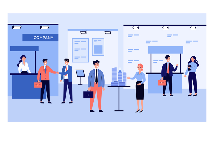
The best trade show displays don’t just look good. They work because the people behind them are prepared to use them.

Here’s a quick-read checklist to make sure your team and your visuals are aligned for your next event.

1. Do They Know What the Signage Is Saying?

Your banners, posters, and backdrops carry your core message. But does your team understand what that message is and how to build on it?

Pro tip: Print out a “Booth Talking Points” sheet. Connect each visual to a key benefit or product.

When your visuals and team speak the same language, you create clarity, not confusion.

2. Can Someone Set Everything Up Without Guesswork?

Large format signage looks amazing when it’s set up correctly.

Retractable banners, tension backdrops, floor decals... they all come with simple mechanics, but your team shouldn’t figure it out five minutes before doors open.

Pro tip: Do a dry run in your office or warehouse. Time it. Pack it. Label it.

That kind of prep makes you look like pros the moment you arrive.

3. Is Someone Assigned to Maintain the Booth’s Appearance?

Foot traffic, giveaways, and constant conversations can wear down even the best-looking booth.

Designate someone to spot-check signage placement, wipe down surfaces, and straighten displays throughout the day.

Pro tip: Create a booth schedule. Assign rotation times for team members to reset and refresh the space.

4. Do Staff Know How to Introduce or Reference the Display Pieces?

Your signage shouldn’t do all the talking, but it can do the opening line.

Make sure your team knows how to use displays as conversation starters.

Instead of:

“Hi, can I help you?”

Try:

“You may have noticed our new service here on the banner; want me to walk you through it?”

Pro tip: Tie product displays and messaging to team introductions. Turn passive visuals into active tools.

5. Is Your Team’s Attire and Demeanor Aligned With the Brand?

Large format print makes your booth look polished. But if your team looks scattered or unsure, that polish wears off fast.

Pro tip: Align team attire (branded shirts, badges, etc.) with your signage and booth color scheme. Keep it clean, comfortable, and confident.

6. Does Everyone Know the Event Goals?

Great print supports a purpose. And so should your team.

Are you trying to gather leads? Launch a new product? Build visibility?

If your team knows what “success” looks like for this show, they’ll be better equipped to represent the brand and use the print materials accordingly.

Pro tip: Start every trade show day with a 5-minute stand-up meeting. Set goals, clarify roles, and reset focus.

When People and Print Work Together, Your Booth Becomes an Experience

Trade show displays are only as effective as the people behind them.

And your team performs best when they know the plan, the products, and the purpose.

We can help with the signage and the strategy to support it. Let’s make sure your next event isn’t just good-looking, it’s good from the inside out.


TGS Direct

📍 16 Franics J Clarke Circle, Suite 104, Bethel, CT 06801
📞 (203) 794-1171
📧 info@tgsdirect.com
🌐 www.tgsdirect.com


Comments

Popular posts from this blog

Make a Statement with Flyers: 5 Things You Might Not Know About Effective Design

  Flyers have been around for decades, but they’re anything but old news. In fact, when done well, they can be one of the most cost-effective and attention-grabbing tools in your marketing mix. The trick? Knowing what most people miss. Here are five flyer design strategies that often go overlooked—and how you can use them to your advantage. 1. Headlines Don’t Have to Explain—They Have to Stop People Your headline isn’t a label. It’s a hook. A lot of flyers start with something safe: “Annual Clearance Sale” or “Join Us for Our Spring Open House.” That’s fine—but it’s also forgettable. If you want someone to actually read your flyer, the headline has to stop them in their tracks. Some options to consider: Ask a question: “Tired of Overpaying for Car Repairs?” Use urgency: “This Weekend Only. No Extensions.” Go bold: “You Bring the Crowd. We’ll Bring the Fireworks.” You can always explain more in the subhead. But the headline’s job is to earn that second glance. 2. White Spa...

Showcase Your Brand with Unique Printing Techniques That Reflect Your Style

  Your print materials don’t just share information—they express who you are. Whether you’re designing brochures, business cards, or product packaging, the finishing choices you make can help your brand stand out in ways that are memorable, tactile, and entirely you. But not every technique fits every brand. What feels premium to one customer might feel over-the-top to another. Here’s how to think about pairing your brand’s personality with unique printing techniques that leave a lasting impression. The Bold and Energetic Brand You’re not trying to blend in—you want to get noticed. For brands with a high-energy identity—think entertainment, retail, hospitality, events—the goal is to attract attention fast. That doesn’t mean going over the top. It means choosing finishes that emphasize movement, light, or contrast. Examples to consider: Spot UV that highlights just one element (like a logo or product image) against a matte background Neon inks for a punch of color that sta...

Patriotic Designs for Memorial Day: H.O.N.O.R. in Print

Memorial Day is a time for reflection—a chance to express gratitude, remember those who served, and unite communities around a shared sense of purpose. While print can’t encapsulate the weight of sacrifice, it plays a quiet and important role in how we honor it. Here’s how thoughtful design helped this year’s Memorial Day messages resonate, using a format that reflects the heart of the holiday itself. H — Hold Space for Stillness Not every flyer needs to be loud to be effective. In fact, the best Memorial Day designs created room for the message to breathe. Whether it was ample white space or a single symbolic image—a folded flag, a solitary silhouette, a poppy in bloom—this restraint helped invite reflection. Design takeaway: When designing for remembrance, let stillness speak. Skip the clutter. Choose fewer elements with more weight. O — Opt for Meaningful Color Red, white, and blue are foundational to patriotic design—but not every campaign needs to use them at full saturat...