
3 Ideas for Creating Impactful Direct Mail Visuals


Direct mail is a form of advertising and communication that has been used for years. Postcards, business cards, letters, flyers, magazines, coupons, and newsletters are all examples of direct mail, and the success rate for these forms of business advertising might be higher than you’d expect.

When done well, direct mail is a tangible, engaging way to interact with existing and potential customers. More than 70% of Gen X consumers believe physical mail is more personal than online digital communications and say they are more likely to read it than email.

So, how can you maximize your direct mail campaigns? One of the most important factors to consider is your pieces' aesthetic appeal and design. A powerful image will grab your viewer’s attention and make them more likely to read the rest of your message.

3 Ideas for Creating Impactful Direct Mail Visuals

With the right strategies, you can ensure your direct mail captures attention, conveys your message effectively, and drives engagement. Read on to learn how to make your direct mail visuals truly impactful.

1. Properly Place Your Images

The placement of images on your direct mail is crucial in ensuring that your recipient absorbs the rest of the information on the piece.

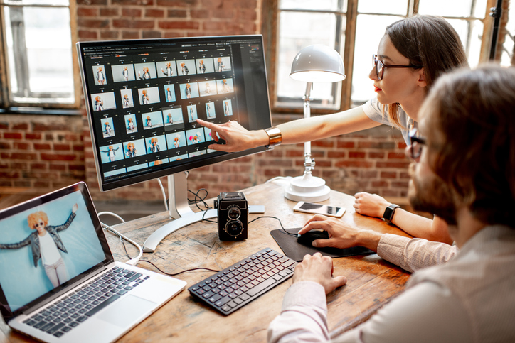
Which area of the design, or which specific words, do you want the viewer’s eye to be drawn to first? One psychological trick many graphic designers utilize is having the subject in the image (person) looking in the direction of, or even pointing to, the text to draw the reader’s eye in that direction.

Leave some white space around your images to avoid a cluttered or distracting layout. Allow the format of your mail piece (tri-fold brochure, postcard, etc.) to guide the placement of your images. Well-placed images will be much more striking and engaging for your viewers.

2. The Role of Color

When choosing the right images to include in your direct mail, don’t forget the importance of color!

While you may have already incorporated your signature company colors through the logo, header/footer, and font color, use images with the same color tones to create consistency and an even more compelling aesthetic appeal.

For instance, if people are in your chosen image, what color is their clothing? What color is the primary background of the photo? What feelings do those colors evoke, and how will that impact the overall message you’re portraying? Keep these considerations in mind when choosing the images for your direct mail.

3. Test the Effectiveness

Ultimately, the best way to know which images connect best with your customer base is by analyzing how they respond to different designs!

One way to do this is by conducting A/B testing, which involves sending two mail designs (each identical except for the image) to an equal number of people and then adding a URL or QR code that recipients can use to get more information. You'll see which image generated a higher response rate by tracking the number of people who utilized each code. This way, you can decide which pictures to include in future mail pieces and maximize your marketing budget.

Contact our company today for high-impact, quality direct mail pieces and all your other printing needs!


Comments

Popular posts from this blog

Make a Statement with Flyers: 5 Things You Might Not Know About Effective Design

  Flyers have been around for decades, but they’re anything but old news. In fact, when done well, they can be one of the most cost-effective and attention-grabbing tools in your marketing mix. The trick? Knowing what most people miss. Here are five flyer design strategies that often go overlooked—and how you can use them to your advantage. 1. Headlines Don’t Have to Explain—They Have to Stop People Your headline isn’t a label. It’s a hook. A lot of flyers start with something safe: “Annual Clearance Sale” or “Join Us for Our Spring Open House.” That’s fine—but it’s also forgettable. If you want someone to actually read your flyer, the headline has to stop them in their tracks. Some options to consider: Ask a question: “Tired of Overpaying for Car Repairs?” Use urgency: “This Weekend Only. No Extensions.” Go bold: “You Bring the Crowd. We’ll Bring the Fireworks.” You can always explain more in the subhead. But the headline’s job is to earn that second glance. 2. White Spa...

Showcase Your Brand with Unique Printing Techniques That Reflect Your Style

  Your print materials don’t just share information—they express who you are. Whether you’re designing brochures, business cards, or product packaging, the finishing choices you make can help your brand stand out in ways that are memorable, tactile, and entirely you. But not every technique fits every brand. What feels premium to one customer might feel over-the-top to another. Here’s how to think about pairing your brand’s personality with unique printing techniques that leave a lasting impression. The Bold and Energetic Brand You’re not trying to blend in—you want to get noticed. For brands with a high-energy identity—think entertainment, retail, hospitality, events—the goal is to attract attention fast. That doesn’t mean going over the top. It means choosing finishes that emphasize movement, light, or contrast. Examples to consider: Spot UV that highlights just one element (like a logo or product image) against a matte background Neon inks for a punch of color that sta...

Patriotic Designs for Memorial Day: H.O.N.O.R. in Print

Memorial Day is a time for reflection—a chance to express gratitude, remember those who served, and unite communities around a shared sense of purpose. While print can’t encapsulate the weight of sacrifice, it plays a quiet and important role in how we honor it. Here’s how thoughtful design helped this year’s Memorial Day messages resonate, using a format that reflects the heart of the holiday itself. H — Hold Space for Stillness Not every flyer needs to be loud to be effective. In fact, the best Memorial Day designs created room for the message to breathe. Whether it was ample white space or a single symbolic image—a folded flag, a solitary silhouette, a poppy in bloom—this restraint helped invite reflection. Design takeaway: When designing for remembrance, let stillness speak. Skip the clutter. Choose fewer elements with more weight. O — Opt for Meaningful Color Red, white, and blue are foundational to patriotic design—but not every campaign needs to use them at full saturat...