4 Business Card Concepts That Make a Big First Impression

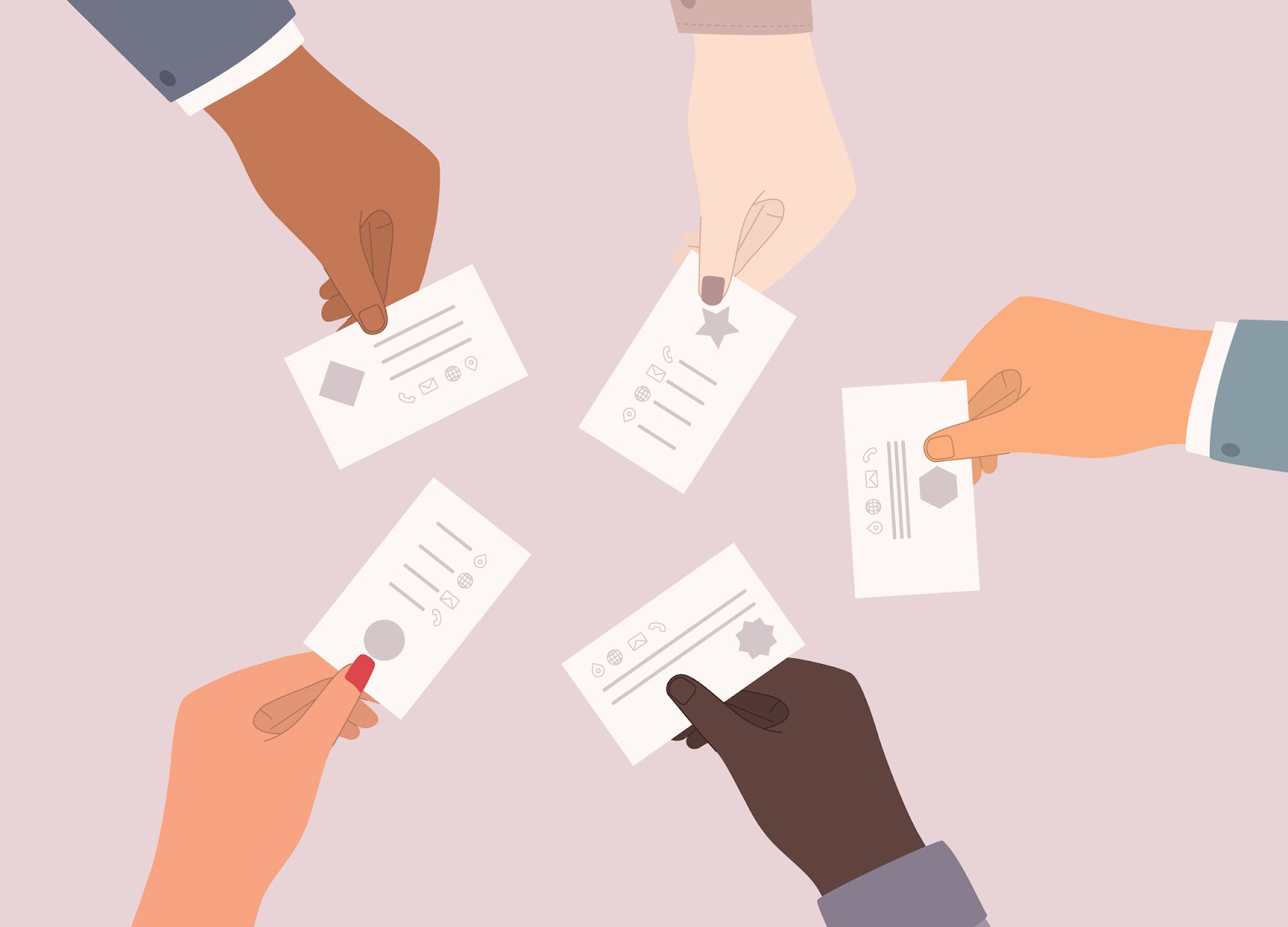
A striking, professional image flows from your primary point of contact – that classic, irresistible, one-of-a-kind business card.

Like a handshake or a personal introduction, your business card leaves a lasting first impression. It's more than contact information; it reflects your brand's personality.

Your brand is unique, and your business card should be too. Perhaps it's time to go big and bold – or simple and sharp – as you refresh your business card.

Four Fresh Business Card Examples

Check out these four innovative business card concepts that break free from convention, leaving a lasting impact on those who receive them.

1. Unexpected Contrasts

While many traditional cards are flat and formal, modern cards keep bending the rules.

Like a dry joke with a witty punchline, some business cards use stark contrast to surprise and entice:

Examples:

  • Handwritten script alongside bold fonts
  • Playful quotes next to minimalist contact details
  • Lively neon stripes juxtaposed with black and white grids
  • Vibrant borders adorning a substantial, neutral-hued foundation
  • A jagged, tear-away strip across a meticulously symmetrical card

2. Tangible Textures

Like an unboxing experience, tactile textures are very satisfying. 

Printed pieces carry significant weight, and you can amplify this impact with foils, recycled materials, or debossing and embossing to raise or depress your favorite design elements.

Texture Examples:

  • Custom seals
  • Textured logos
  • Corrugated cardboard overlays
  • Raised geometric patterns
  • Iridescent stripes
  • Gel-style fonts on transparent plastic cards

3. Product-First Promos

Have you ever rummaged through stacks of paper, looking for a contact buried in the chaos?

Make it easier for people to connect with you! Hospitable marketing puts the customer first, so why not lead with the product or promo they want most? Product-first business cards can feature the deal of the month, a photo of your most popular product, or an embossed caricature of your café's favorite menu item. Let the graphics do the talking while making your contact secondary.

Product Examples:

  • A calculator for an accounting firm
  • A dog for a groomer
  • A barbell for a personal trainer
  • A vacuum for a cleaning business
  • A charcuterie board for a caterer
  • An arrow between points A and B for couriers

4. Memorable Shapes

Did you know our brains process images 60,000 times faster than text?

Accelerate your message and provide a powerful memory aid using a themed business card with a clever die-cut shape.

Die Cut Examples:

  • A camera-shaped photography card
  • A mug-shaped coffee card
  • A key-shaped locksmith card
  • A hammer-shaped handyman card
  • A daisy-shaped florist card

You Dream It, We'll Print It

Why settle for boring when business cards offer such unbeatable curb appeal?

Exude confidence with captivating, unforgettable pieces that mirror the distinctive essence of your brand.
Wondering what's possible? Head to our website and request a quote today!


Comments

Popular posts from this blog

Make a Statement with Flyers: 5 Things You Might Not Know About Effective Design

  Flyers have been around for decades, but they’re anything but old news. In fact, when done well, they can be one of the most cost-effective and attention-grabbing tools in your marketing mix. The trick? Knowing what most people miss. Here are five flyer design strategies that often go overlooked—and how you can use them to your advantage. 1. Headlines Don’t Have to Explain—They Have to Stop People Your headline isn’t a label. It’s a hook. A lot of flyers start with something safe: “Annual Clearance Sale” or “Join Us for Our Spring Open House.” That’s fine—but it’s also forgettable. If you want someone to actually read your flyer, the headline has to stop them in their tracks. Some options to consider: Ask a question: “Tired of Overpaying for Car Repairs?” Use urgency: “This Weekend Only. No Extensions.” Go bold: “You Bring the Crowd. We’ll Bring the Fireworks.” You can always explain more in the subhead. But the headline’s job is to earn that second glance. 2. White Spa...

Showcase Your Brand with Unique Printing Techniques That Reflect Your Style

  Your print materials don’t just share information—they express who you are. Whether you’re designing brochures, business cards, or product packaging, the finishing choices you make can help your brand stand out in ways that are memorable, tactile, and entirely you. But not every technique fits every brand. What feels premium to one customer might feel over-the-top to another. Here’s how to think about pairing your brand’s personality with unique printing techniques that leave a lasting impression. The Bold and Energetic Brand You’re not trying to blend in—you want to get noticed. For brands with a high-energy identity—think entertainment, retail, hospitality, events—the goal is to attract attention fast. That doesn’t mean going over the top. It means choosing finishes that emphasize movement, light, or contrast. Examples to consider: Spot UV that highlights just one element (like a logo or product image) against a matte background Neon inks for a punch of color that sta...

Patriotic Designs for Memorial Day: H.O.N.O.R. in Print

Memorial Day is a time for reflection—a chance to express gratitude, remember those who served, and unite communities around a shared sense of purpose. While print can’t encapsulate the weight of sacrifice, it plays a quiet and important role in how we honor it. Here’s how thoughtful design helped this year’s Memorial Day messages resonate, using a format that reflects the heart of the holiday itself. H — Hold Space for Stillness Not every flyer needs to be loud to be effective. In fact, the best Memorial Day designs created room for the message to breathe. Whether it was ample white space or a single symbolic image—a folded flag, a solitary silhouette, a poppy in bloom—this restraint helped invite reflection. Design takeaway: When designing for remembrance, let stillness speak. Skip the clutter. Choose fewer elements with more weight. O — Opt for Meaningful Color Red, white, and blue are foundational to patriotic design—but not every campaign needs to use them at full saturat...