When it comes to designing for print, color combinations play an essential role in drawing the eye of your consumers.
Colors should be chosen thoughtfully to create a compelling visual design that conveys your project's specific purpose and message, ultimately helping your company make a memorable impact.
Each color combination has unique characteristics and can evoke different emotions and responses from viewers. Here are 13 captivating color combinations to elevate your design.
9 Color Combinations That Capture Attention in Print
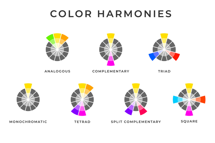
1. Analogous
This combination consists of three to five colors beside each other on the color wheel.
It gently transitions from one hue to another, creating an inviting atmosphere. Analogous colors are great for creating a specific mood or evoking emotion.
2. Complementary
This color combination is based on two colors found at opposite ends of the color wheel.
These colors create a bold contrast and add excitement to your print materials. Be mindful of balancing the proportions of each color to maintain visual harmony and avoid overwhelming the viewer.
3. Triadic
This color palette uses three equally spaced colors on the color wheel.
They create a lively, vibrant color palette and appear more harmonious than complementary color combinations. It offers many possibilities for incorporating different hues and tones, enabling you to find the perfect color combination to reflect your brand's personality.
4. Monochromatic
This combination uses various tints and shades of a single color.
Monochromatic colors are harmonious and calming, creating a unified design. By playing with light and dark within the same color family, you can add depth and dimension to your print designs.
5. Tetradic
A pattern of four colors evenly spaced on the color wheel, the tetradic combination balances warm and cool tones to create an eye-catching look with lots of variety.
6. Split Complementary
The split complementary palette uses a base color and two colors next to its complementary color on the color wheel.
It is a modification of the complementary combination that offers greater versatility in design.
7. Pastel
This color palette uses muted versions of brighter hues or tints of pure colors.
Pale and subtle, this combination creates a soothing, peaceful atmosphere. Use them to add a subtle touch of elegance and sophistication to your print materials.
8. Rainbow
This color arrangement utilizes the full spectrum of colors from red to violet.
It can be used to create dynamic designs with high visual impact.
9. Earth Tones
This combination includes natural shades like browns, greens, yellows, and blues.
These colors evoke a sense of warmth, stability, and connection to nature and are often selected for organic, natural designs.
Can Color Combinations Help Draw Attention to My Company?
No matter what type of print project you are working on, understanding how color combinations work together can help create compelling visual designs that capture attention and convey the purpose and message of your project.
Let us help you experiment with combinations to find the perfect colors for your brand and needs. Contact us today by phone or email to create your next marketing masterpiece.
Comments
Post a Comment